CLIENT: SOUTHERN OPERA
PROJECT: ADVERTISING CAMPAIGN & PROGRAMME
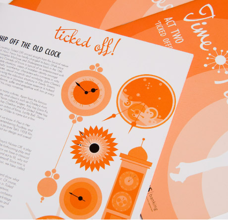
Extending 'Time Pieces' theme of chronological disorder, time motifs are built into the programme, billboards, posters, newspaper advertisements and flyers. Layout echoes film posters of the 1950's in response to the setting of the first act. Eccentric and retro, while embracing the clean edges of contemporary graphics, the material's typography emphasises Southern Opera's joyous approach to opera. Clock-like layers of circles radiate from the background.
The design is tightly linked to the play - even the orange and black colour scheme was chosen in accord with the set designers – and the simplicity of the core hourglass silhouette body, amber circles and 'Time Pieces' logo transfers with elegant continuity from flyer to poster to newspaper. As subtly bold as the production itself, the promotional material delivers a fresh, sharp parade down South Island streets to herald the arrival of 'Time Pieces'.