CLIENT: NZ PEONIES
PROJECT: BRANDING & PACKAGING
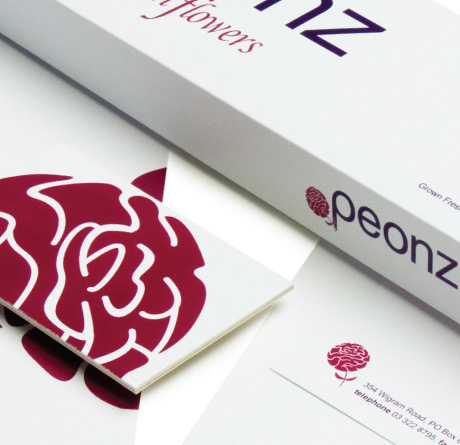
NZ Peonies are a thriving local exporter of peonies. Peonz approached us to rejuvenate its branding - to exhibit Peonz as a fresh and visible player on a global platform. The focus began by constructing a versatile logo: compact on business documents, yet energetic when illustrating packaging.
The stylized peony is simple and iconic. Like a modern spin on the wax seal, the crimson petals adorn letterheads and flower boxes timelessly. Embracing the clean edges of a modern font for 'Peonz' while retaining graceful lettering for 'fresh flowers', Peonz' branding shows how graphic designers can fuse ostensibly conflicting aesthetics into a coherent and memorable whole.