CLIENT: CARLTON TAYLOR
PROJECT: BROCHURE
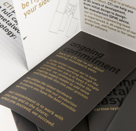
This brochure explains the services that Carlton Taylor provides. Distilling the metalwork process into a concise and appealing eight-panel brochure took a range of techniques. We focused on the brochure's typography. Using metallic inks and over-glossing in areas created attraction.
We made a simple step-by-step flyer into something a bit more captivating. Folds are unconventional, images overlap, textures and inks vary-all while maintaining clarity.

