CLIENT: MAINLAND CAPITAL
PROJECT: WEBSITE
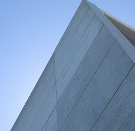
Mainland Capital was a startup company requiring a website and branding. They are building investment focussed. It made sense to use imaging of buildings to convey impressions of strength and quality, and infrastructure.
BRAND. Mainland is a commercial property asset manager. We used imaging of buildings to convey impressions of strength, quality, and infrastructure. The logotype underlined this theme. It utilises solid typography that is understated but suitable for current and future application to buildings and promotional material.
WEB. Navigation of the site itself is intuiative, with topics opening up to provide access to detail within a section. To invoke a sense of action and company vitality we used photographs of the directors literally on the move. The result is that the web is aspirational. It presents Mainland Capital as a solid, professional team going places.
Photography was a combination of Michael Woods shots for buildings and commissioned photography by Kaptured. See http://www.kaptured.com/

